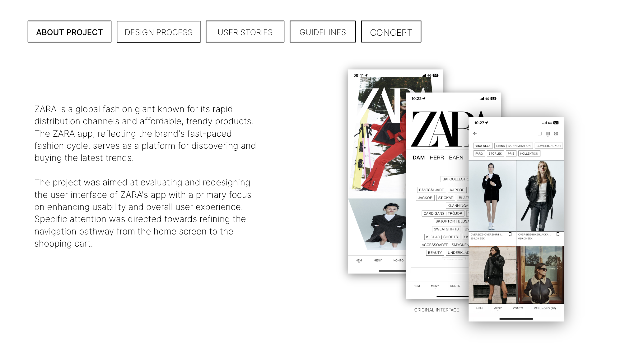
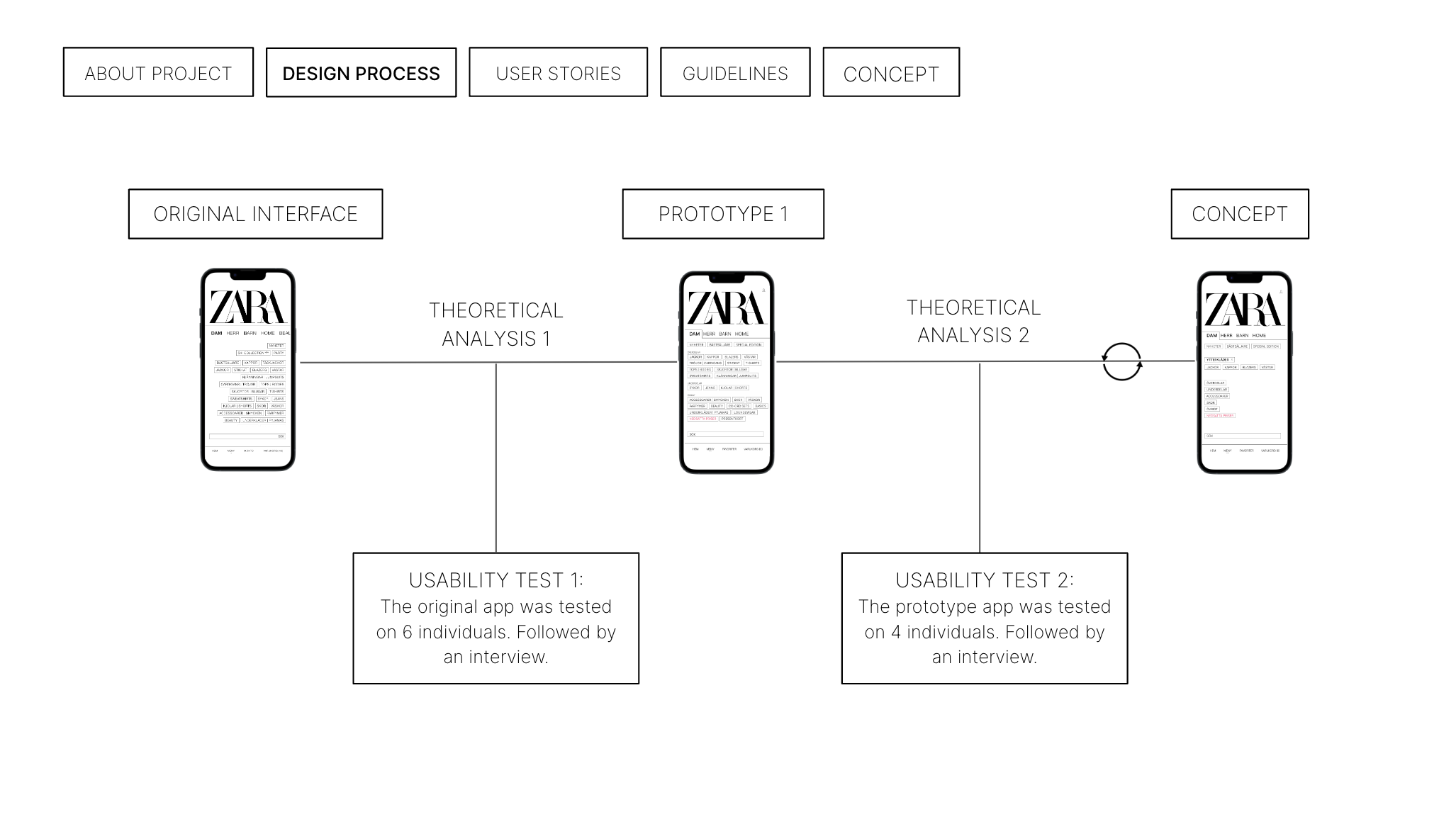
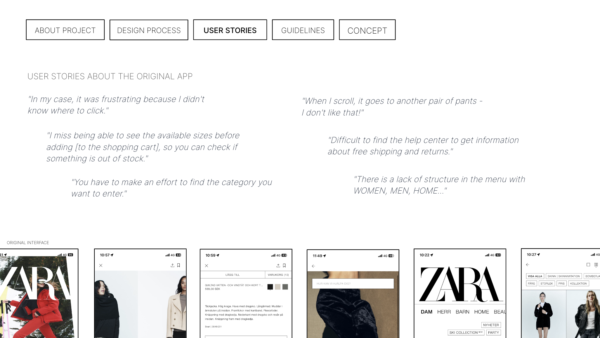
This group project within the “Usability – Methods and Tools” course provided experiences in conducting usability tests, identifying, and addressing issues in a user interface. We decided to work on the clothing brand ZARA’s shopping app as we have heard that some users experience frustration when using it. The final results were presented orally and in a portfolio variant, from which the majority of the images below are derived. The software Figma was utilised to design both the look and functionality of the redesigned interface, including the creation of mockups for the presentation.
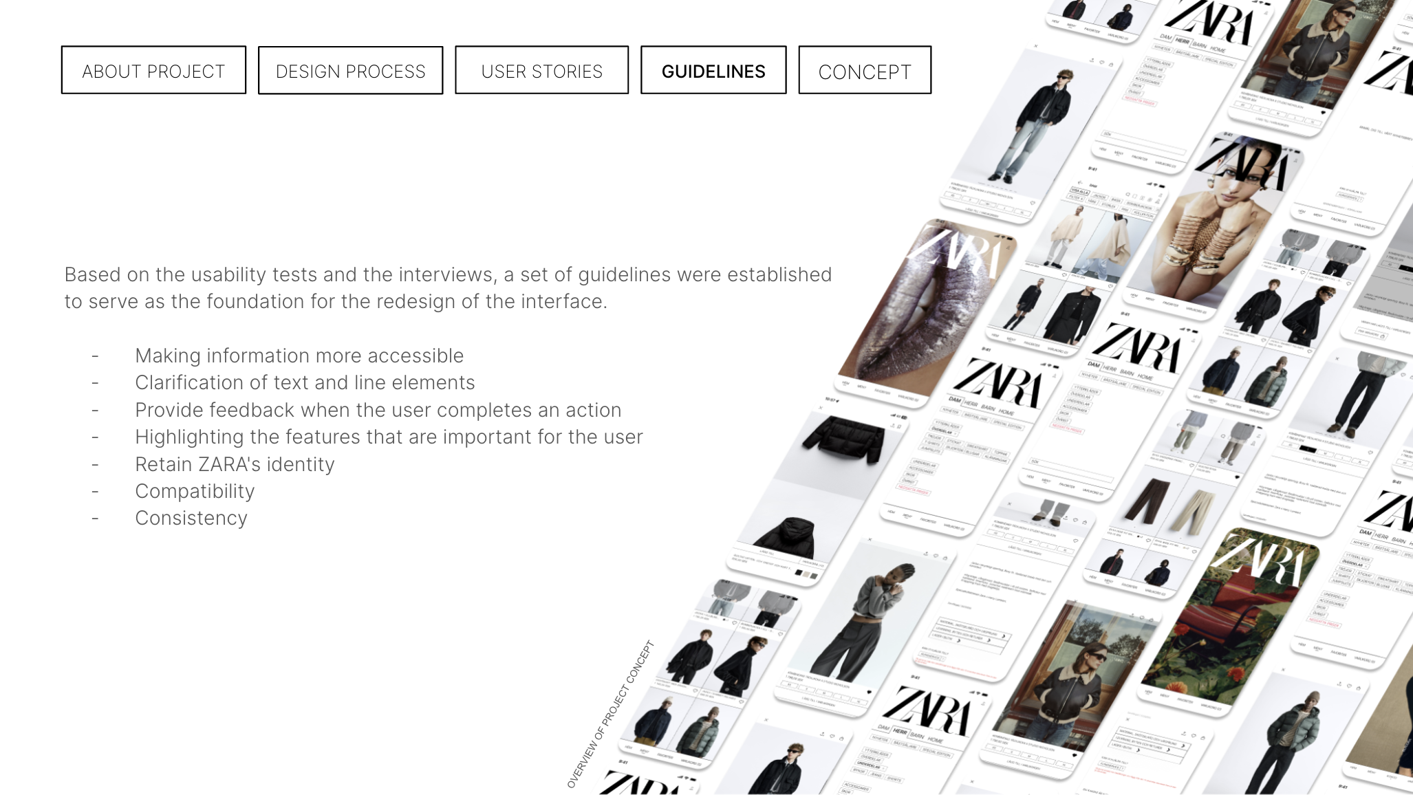
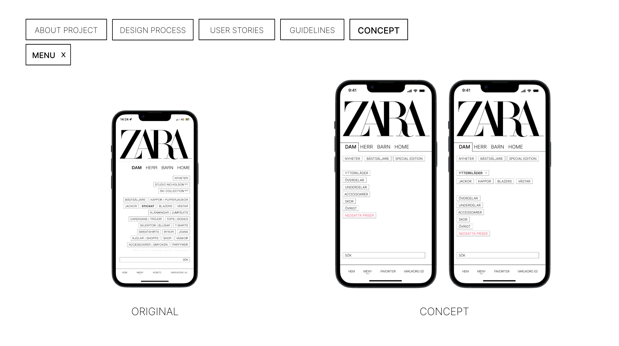
MY RESPONSIBILITY – THE MENU PAGE
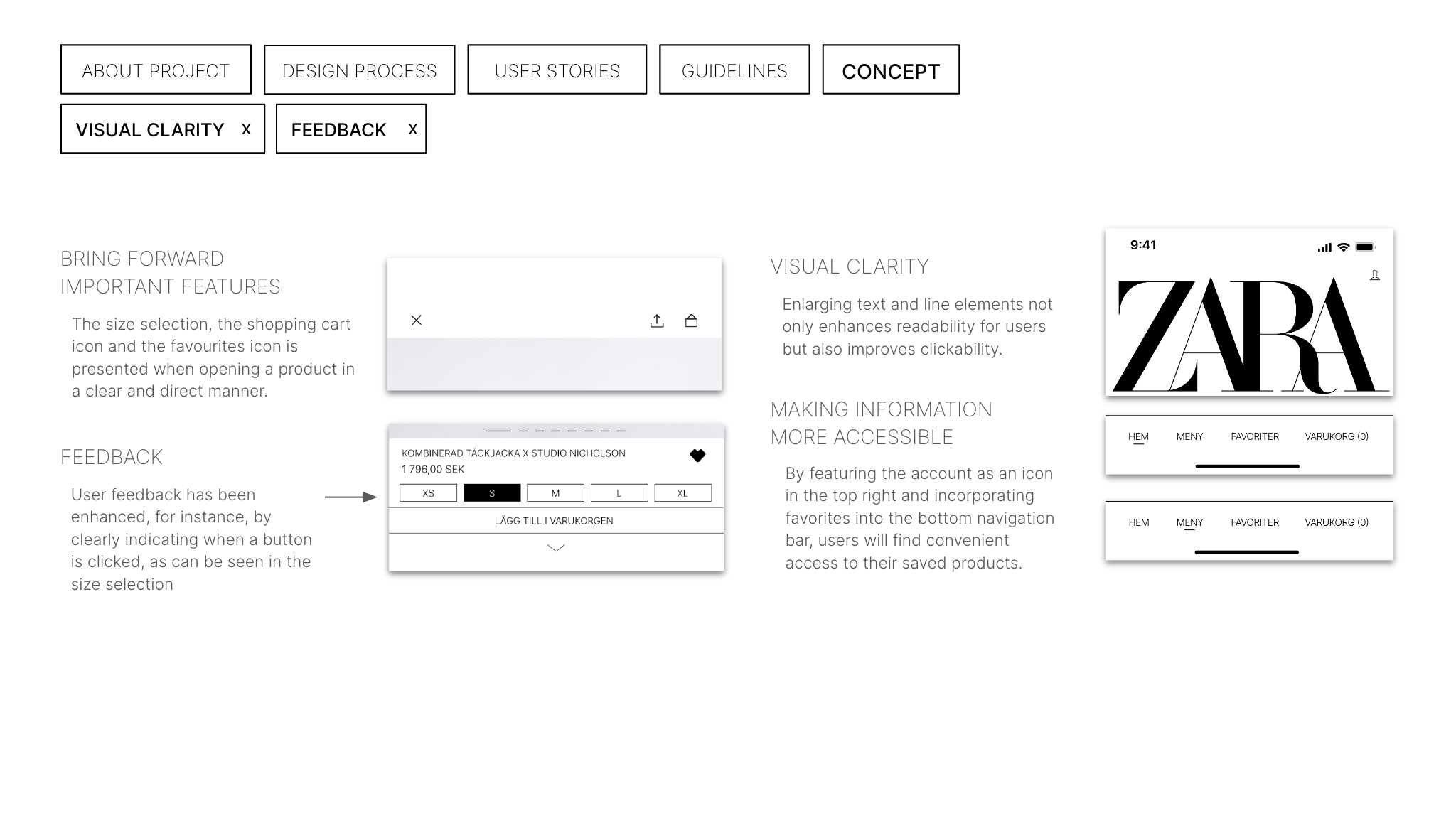
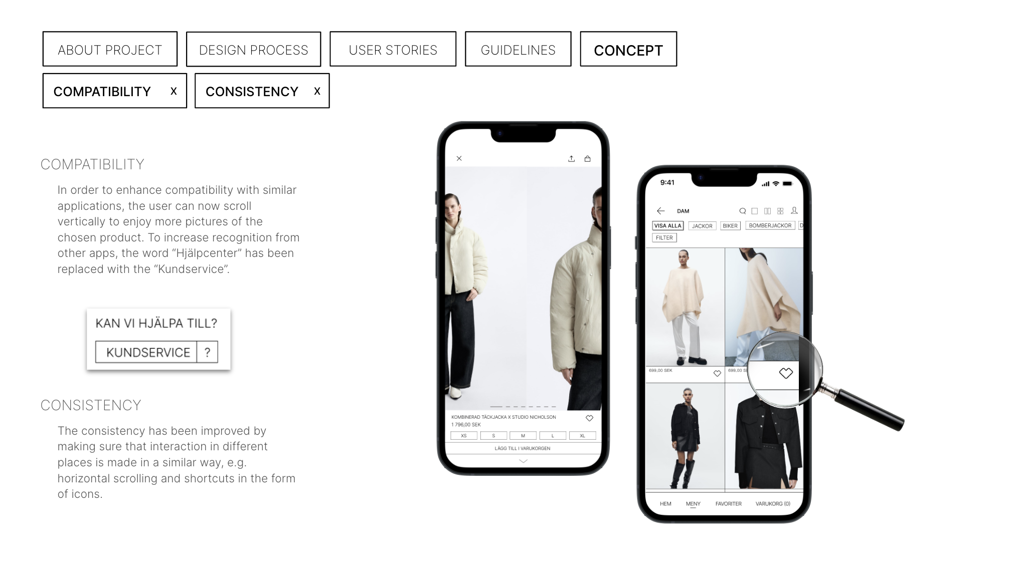
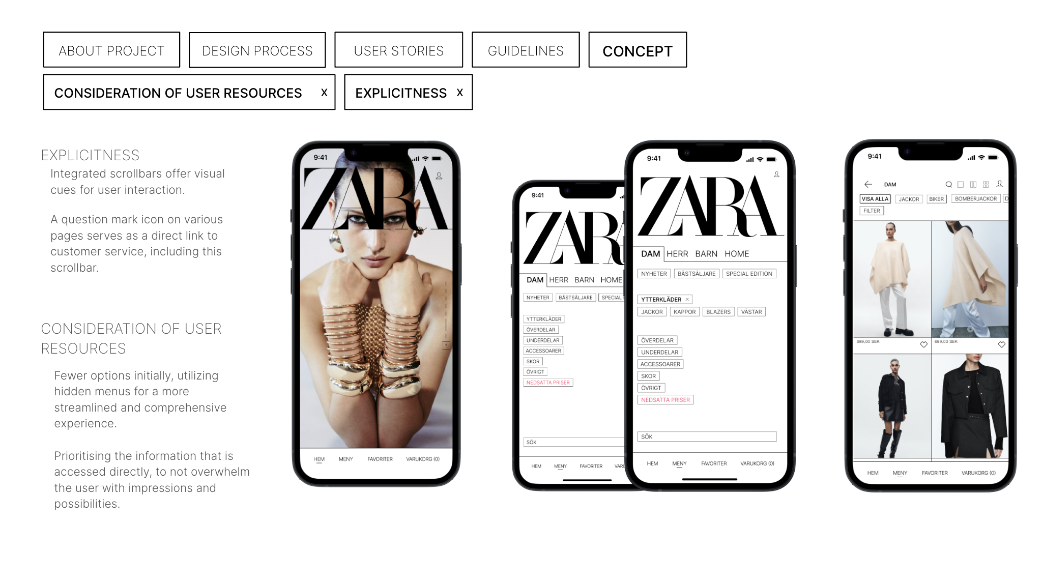
During the development of the redesign, we divided the work within the group, and I was given the overall responsibility to make the menu page more user-friendly. My focus was largely on reducing the number of choices available to the user at first glance, as this was an aspect that several test subjects had found overwhelming and confusing, causing frustration with the existing app. Therefore, the concept we developed consisted of a smaller number of main categories that, when clicked, provided the user with more detailed options for each main category. This way, users could more easily locate the type of clothing they wanted to explore